Challenge
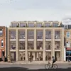
For their new territorial headquarters the Salvation Army opted to use a site already in their ownership next to the Grade II-listed William Booth College at Denmark Hill, designed by Giles Gilbert Scott in 1929. Our challenge was to work within this very sensitive heritage context, responding appropriately to this impressive and distinctive neighbour, without delivering unnecessary opulence or pastiche. The Salvation Army wanted a high-quality, long-lasting building that was fitting to their practical values of ‘soup, soap and salvation’. This is a once-in-a-generation project for the charity as they reassemble on this historic site. Future-proofing took on a different form as the building is very unlikely to be occupied by others.

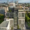
Aerial view looking south-east of completed Territorial Headquarters building adjacent to William Booth College and Denmark Hill station

The need for an atrium-centred plan arose from our early briefing conversations. The atrium became a way of introducing visual and physical connectivity to encourage more staff interaction, but also enabled us to achieve the capacity needed by bringing light into the necessarily deep plan
1 / 2
Concept sketches showing cruciform layout and elevation development, inspired by some of his Sir Giles Gilbert Scott’s architectural trademarks – dark brick detailed with a vertical emphasis, intricate stone dressings, a tall central tower and a formal, symmetrical plan

Layout development - Enclosing the central atrium are two blocks, pulled apart and scaled to match the existing blocks on the eastern side of the campus. The northern block is broken to create a separate corner ‘tower’ which landmarks the building and echoes the symmetry of the original masterplan
Main moves
We started by massing the building to respond to the missing symmetry of the site, mirroring the volume of the blocks east of the main college building. It has a similar language and scale to the Gilbert Scott original, adapted to be unmistakeably contemporary. Instead of a quadrangle-like courtyard, it has a large internal atrium to connect its users, aligned – through a glazed opening at one end – with the tower of the college, and with a connective stair running up its full height. We placed open plan office space close to windows, breakout space around the edge of the atrium, and planned the ground floor so that the café and multi-function spaces can be zoned off for public access, providing a ‘shop front’ to the charity and connectivity to the wider community via meetings, events, prayers and music.

Model showing the block massing of the new Territorial Headquarters
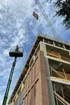
Emerging atrium with views to William Booth College tower, 15 July 2022
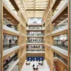
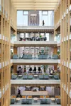
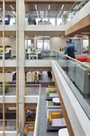
The new atrium space has now become the beating heart of the charity, with visual connections between almost all areas and a feature stair facilitating circulation


View from Denmark Hill corner. Expressed corner massing book-ends the wider William Booth College masterplan. GRC framing and inset cross in brickwork maximise the impact of the building at this key junction approach
Detail
The outside of the building is clad in brick, in a lighter tone than the Giles Gilbert Scott buildings but with darker flecks echoing its neighbour. The vertical brick piers – which follow the principles and proportions of the college – alternate with large areas of glazing, giving the headquarters transparency and light but an equal sense of solidity when viewed from an oblique angle. We varied the order and language on the north-western corner, insetting a cross into the brickwork, conscious that our building will act as both a marker and foreground to the college when approached from Denmark Hill.
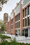
A key challenge was to establish a strong relationship between the new Territorial Headquarters and historic William Booth College
1 / 2
Facade detailing and material palette pay homage to the William Booth College architecture. The use of deep window recesses and expressed brick piers echo the solid brickwork of the neighbouring campus
Impact
The work of The Salvation Army is varied – from helping victims of modern slavery through to nurseries, community choirs and foodbanks. Fundamentally their mission is to make a positive impact on communities they serve across the world. A building is not just about bricks and mortar; it is about the activities that it facilitates. The architecture of the new headquarters functions not just for the work of The Salvation Army, but it also opens it up to the public.
1 / 2
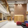
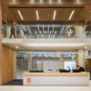
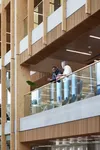
Double-height reception space with floating bridge walkway
1 / 4
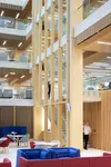
Breakout space at the base of the atrium links to the upper floors with a feature stair

Use of timber defines the flexible space at the atrium’s edge while also concealing services and absorbing sound break-out, with exposed concrete ribbed soffits defining open-plan workspace
1 / 5
View from rear terrace entrance looking towards main entrance. The tree-lined surroundings provide backdrops of greenery throughout the building
Sustainability
Our sustainability strategy began with the client’s vision for a building that would last at least a hundred years. We kept to a simple set of carefully-chosen materials throughout, to minimise the building’s embodied carbon and performance in use, and also to reflect the values and identity of our client. The structural concrete slab is made from 50% GGBS – a by-product from the steel industry which reduces the amount of cement needed in the mix – and is ribbed to further reduce the amount of material required. This in turn brings down the weight of the building and the size of foundations needed. This is a 20% saving compared to a standard concrete mix. Inside, the concrete is exposed to maximise its thermal properties, softened with an oak lining. The roof level also accommodates around 100 PV panels. The building achieved its BREEAM Excellent target.
“It’s a huge privilege to work with The Salvation Army on their new Territorial Headquarters. Our vision was to reflect their core values with a strong emphasis on wellbeing and sustainability while also acknowledging their history on the site and enhancing the setting of the adjacent listed campus.”
Andrew Tate, TateHindle
Wellbeing
Light, Peace and Hope by Stephanie Lamplough – read at the opening of the building on 28 November 2023:
The splendour, the light, the open space,
How blessed we are to be in this place.
Amongst the excitement and babble there is a holiness, a peace,
God is truly at the centre, his Spirit released.
But is the hope we have for these six floors
Big enough for the people who pass by these doors,
Let us take this light out of these walls,
Into a world where Jesus so clearly calls,
May we share this peace that we feel deep inside,
With others who in darkness hide,
And may the hope we gain from a simple cup of tea,
Be shared out there in our community.
For whilst Jesus is the light, peace and hope in this space,
We are charged to be the same for the whole human race.
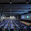
Photo from the opening ceremony, 28 November 2023


